If you want to know where market stress starts and where it ends up, directional volatility is the tool to watch.
I’d sum up the article like this: it explains how volatility moves between WTI, Brent, Henry Hub natural gas, and gold, how to tell which market is a net sender or net receiver, which models are used to measure that flow, and how to set up clean data before running the analysis. It also shows why this matters during shock periods like March 2022, when Brent moved near $139 per barrel and gold climbed as money moved into safer assets.
Here’s the article in plain English:
- I look at volatility, not price direction.
- I track spillovers between oil, gas, and gold.
- I use net spillover = volatility sent - volatility received.
- I treat WTI and Brent as common transmitters, gold as a common receiver, and natural gas as the market whose role shifts the most.
- I pick models based on the question:
- VAR / Diebold-Yilmaz for daily spillover mapping
- Frequency-based models for short-term vs. long-term shock split
- BEKK/DCC-GARCH for changing correlation
- TVP-VAR when market links shift over time
- I keep all series aligned by USD, timestamps, units, and sampling frequency
- I read output by checking row sums, column sums, and net values
- I do not trust one snapshot alone; I check rolling windows and correlation spread
A fast way to think about it: if one market has more outgoing volatility than incoming volatility, it is leading stress. If it takes in more than it sends, it is reacting to stress.
| Market / Item | Usual Role | What I Watch |
|---|---|---|
| WTI crude | Net sender | Spillovers into gas and gold |
| Brent crude | Net sender | Global shock transmission |
| Henry Hub gas | Changes often | Regime shifts and sharp swings |
| Gold | Net receiver | Risk absorption and hedge use |
| Daily data | Best for broad connectedness | Cleaner setup |
| Intraday data | Best for realized volatility | More noise, more prep |
If you’re reading the full piece, the main takeaway is simple: directional volatility is less about “how much did this market move?” and more about “who pushed the risk through the system?”
Key Terms: Volatility, Spillovers, and Net Transmitters
Volatility and Realized Volatility
Volatility measures the size of price swings, not the direction of the move.
Realized volatility takes intraday prices, often sampled every 5 minutes or every hour, and rolls them into a single daily measure. That gives you a fuller read on market movement than daily closing prices alone can provide.
That difference matters. Spillover models track volatility, not whether prices went up or down.
Directional Spillovers: To Others, From Others, and Net Effects
Directional spillovers show how volatility passes from one market to another.
"To others" tells you how much volatility an asset sends out. "From others" tells you how much it takes in. Net spillover is simply to others minus from others.
| Role | Net Spillover | What It Means |
|---|---|---|
| Sender | Positive (Net > 0) | Sends more volatility than it receives |
| Receiver | Negative (Net < 0) | Absorbs more volatility than it sends |
These measures sit behind connectedness matrices and network graphs.
Sender-Receiver Patterns in Energy and Metals
Across many samples, crude oil shows up as a net transmitter, gold tends to be a net receiver, and natural gas stands out as the most variable market.
Those roles don’t stay fixed forever. They shift over time, and connectedness models are built to track exactly that.
sbb-itb-a92d0a3
How to Interpret Cross-Asset signals, Volatility, and Flows into Commodities
Main Models for Measuring Directional Volatility
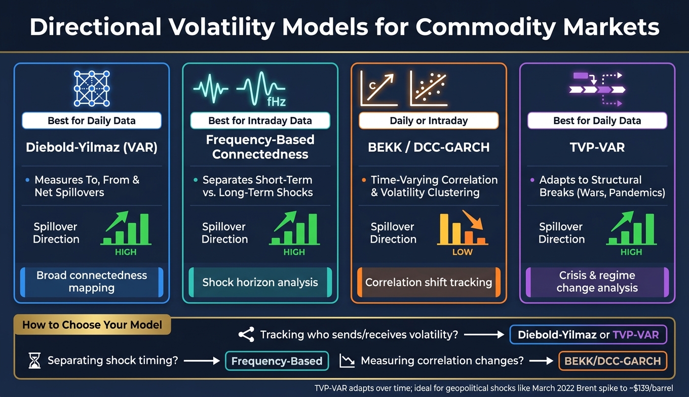
Directional Volatility Models for Commodity Markets: A Side-by-Side Comparison
Once you understand directional spillover, the next step is picking a model that can measure it in a clear way.
Diebold-Yilmaz Connectedness and Variance Decomposition
The Diebold-Yilmaz model turns sender-receiver spillovers into numbers you can work with. It starts with a Vector Autoregression (VAR) model and uses generalized forecast error variance decomposition (GFEVD) to estimate how shocks in one market spill over into other markets. The output shows spillovers to others, from others, and the net spillover for each asset.
The baseline setup works well on its own. But the newer versions help when you want to look at timing, persistence, or shifts in relationships over time.
Frequency-Based, GARCH, and TVP-VAR Extensions
Three model families build on the baseline, and each one is built for a different job.
Frequency-based connectedness breaks spillovers into time horizons. That means you can separate short-term, temporary shocks from long-term, persistent ones. If you're working with intraday data and care about short-run moves, this approach is often a good fit.
BEKK-GARCH and DCC-GARCH focus on time-varying correlation and volatility clustering. These models make sense when the main issue is how correlation changes over time, not just who sends or receives shocks.
TVP-VAR (Time-Varying Parameter VAR) keeps the directional spillover logic from Diebold-Yilmaz, but lets the coefficients shift over time. That matters when market links don't stay still, especially during geopolitical stress or crises such as COVID-19.
Model Comparison and Trade-Offs
Use the table below to match the model to your data and the question you're trying to answer.
| Model | Best Data Frequency | Key Strength | Spillover Direction |
|---|---|---|---|
| Diebold-Yilmaz (VAR) | Daily | Measures to, from, and net spillovers | High |
| Frequency-Based | Intraday | Distinguishes short- vs. long-term shocks | High |
| BEKK / DCC-GARCH | Daily / Intraday | Captures time-varying correlation and volatility clustering | Low (correlation focus) |
| TVP-VAR | Daily | Adapts to structural breaks such as wars or pandemics | High |
For daily data, VAR and TVP-VAR usually show the broad spillover pattern. For intraday analysis, frequency-based and GARCH-family models can do a better job with fast price moves. In plain English, the right pick comes down to two things: how often your prices update, and how neatly the series line up.
Data Setup: Benchmarks, Frequency, and API-Ready Workflows
Once you know the spillover model, the next job is building a clean, aligned input panel.
Choosing Benchmarks and Aligning Price Series
Directional connectedness works only when each series uses the same currency, market clock, and sampling frequency. For U.S.-based analysis, stick with matched series from the same benchmark set. The model can’t tell who sends volatility and who absorbs it unless the inputs line up first. Using USD-denominated series also cuts down on currency-related noise.
| Benchmark | API Code | Unit |
|---|---|---|
| WTI Crude Oil | WTI_USD |
USD/barrel |
| Brent Crude | BRENT_CRUDE_USD |
USD/barrel |
| Henry Hub Natural Gas | NATURAL_GAS_USD |
USD/MMBtu |
| Gold | GOLD_USD |
USD/troy oz |
After you match the series, standardize timestamps before doing any gap handling. If timestamps don’t line up, spillover estimates can get warped fast. Check missing observations and holiday gaps against the source publication calendar before you interpolate or fill anything in. Start with the raw timestamps, then deal with gaps. For reports, format dates as MM/DD/YYYY.
If you mix spot and futures data, things can get messy. It’s better to keep one data type all the way through. Use futures endpoints only when settlement or roll logic matters.
Daily vs. Intraday Data for Volatility Measurement
Use daily data for standard connectedness work. Use raw data when you need realized-volatility inputs.
Daily rows (interval=daily) fit long-run spillover analysis well. Raw observations (interval=raw) pick up the intraday moves needed to build realized volatility. The tradeoff is simple: raw data gives you more detail, but it also needs more cleaning and brings more market microstructure noise with it. If you want an intraday setup that’s easier to monitor in practice, interval=1h is a solid middle ground.
Using OilpriceAPI to Source Oil, Gas, and Gold Data
Use one source and one format across all series. That alone helps avoid a lot of alignment mistakes.
OilpriceAPI offers JSON REST access to Brent Crude, WTI, Natural Gas, and Gold prices. The /v1/prices/historical endpoint supports custom date ranges and interval selection, which makes it straightforward to pull the series needed for spillover analysis. The /v1/analytics/statistics endpoint returns annualized volatility and Z-scores, giving you a quick data check before modeling.
Validate every response before you move on. Confirm that:
- the price is finite
- the currency is USD
- the unit stays constant across the series
- the source metadata is logged
How to Read Sender-Receiver Results and Apply Them
Once the model is estimated, the next job is figuring out who is sending volatility and who is taking it in.
Reading Matrices, Row Sums, Column Sums, and Network Graphs
When the model runs, it gives you a connectedness matrix. Each cell shows how much volatility moves from one market to another.
Here’s the plain-English version: row sum is the total volatility a market receives, column sum is the total volatility it sends, and net spillover is column sum minus row sum. If the net value is positive, that market sends out more volatility than it absorbs, so it is a net sender. If the net value is negative, it absorbs more than it sends, so it is a net receiver.
| Metric | Plain-Language Meaning | Role |
|---|---|---|
| Row Sum | Total volatility received from others | High value = sensitive absorber |
| Column Sum | Total volatility sent to others | High value = main transmitter |
| Net Value (+) | Gives more than it takes | Risk driver (main transmitter) |
| Net Value (−) | Takes more than it gives | Main receiver |
Network graphs tell the same story in a more visual way. Arrows go from sender to receiver. Thicker lines mean stronger transmission. So if one market has a lot of thick outgoing arrows, it is pushing risk through the system. If most arrows point into a market, that market is mostly reacting rather than leading.
Typical Patterns in Crude Oil, Natural Gas, and Gold
You can use these readings to compare crude oil, natural gas, and gold side by side.
WTI and Brent usually show similar sender-receiver roles. Natural gas is the one that tends to move around the most, and its sender-receiver role can shift more from one period to another. Gold adds a useful quick check: a Z-score above 2.0 or below -2.0 means the price is far from its mean, which can help you spot a regime change before you make any spillover call.
Conclusion: A Practical Checklist for Directional Volatility Analysis
After you read the output, the next step is pressure-testing it over time. The main idea is simple: don’t make portfolio or risk decisions from one snapshot alone.
Before acting on the results, work through this checklist:
- Define your volatility measure so it stays consistent with the model and the data available.
- Confirm benchmark alignment by putting all series in USD, normalizing units, and aligning timestamps to UTC.
- Match data frequency to the spillover horizon.
- Read net spillovers before acting and check whether sender and receiver roles stay steady or change in rolling windows.
- Check rolling correlations. If the spread in rolling values starts to widen, that points to a regime shift.
Track rolling spillovers over time too. When correlation dispersion widens, that’s another sign the market regime may be changing.
FAQs
How is directional volatility different from correlation?
Correlation shows how two commodity prices move in relation to each other. It uses a coefficient from -1 to +1 to show both the direction and the strength of that link.
Volatility measures how much the price of one asset moves over time. It’s usually shown as an annualized percentage. Put simply, correlation looks at a pair of markets, while volatility looks at the price swings of a single market.
When should I use daily data instead of intraday data?
Use daily data when you want the big picture. It works well for long-term trends, week-over-week comparisons, or reports with one row per date. You also get cleaner chart data because daily values smooth out price swings, cut down data transfer, and make trend analysis easier.
Use intraday data when you need close-up detail. It's the better fit for short-term trend monitoring or technical analysis within a single trading session.
Why does natural gas switch between sender and receiver?
Natural gas can shift between sender and receiver because it responds fast to both local market conditions and the links between gas and the rest of the energy market.
Across benchmarks like Henry Hub, TTF, and JKM LNG, volatility can begin with regional demand, pipeline or export capacity limits, or sudden weather changes. When those drivers set the pace, gas acts as a sender. When the move comes from broader energy-market ties or correlations with oil, gas turns into a receiver.